Python class in one-liner

This post was imported from my old blog “make YJL” on 2010-09-28. Some stuff in this post may be broken, please leave a comment if you see any, then I will try to fix it.

Sometimes, I like tweeting in code instead of plain words. So I tweeted this:

exec('class Me:\n def drink_beer(self): self.has_headache = True') ; me = Me() ; me.drink_beer() ; print me.has_headache #BEER

exec is a statement not a function1.

I had tried to use eval() first but it only accepts expression, so exec seems to be right one to use because it accepts statement, well you can feed it with a entire source file actually. If we just give our code, then the code will be executed in current scope.

I do this is because I need to have one-liner code, you don't have \n or <br/> on Twitter2, I just wrote it for fun. If you want to use eval() or exec in real program, you must use them with care.


  1. This would work because a tuple with only one element is not a tuple but the element unless you append with , after that only element3. So it is evaluated like exec only_element^

  2. Actually it has \n but you have to go to HTML source code, atom feed, or json via API. In the representation of HTML, \n doesn't give your line break. ^

  3. "A single item tuple must have a trailing comma, such as (d,)." Source ^

Writting posts using Markdown lightweight markup language

This post was imported from my old blog “Tux Wears Fedora” on 2010-09-28. Some stuff in this post may be broken, please leave a comment if you see any, then I will try to fix it.

I have been writing posts using Markdown with python-markdown2.

Using it makes me feel more clear while I am writing a post. One thing I love most of Markdown is how we make a link. Here is an example:

This is a [text][link-id].

[link-id]: http://example.com

That is how you can make links1. If your post has, say, a dozen of links, the HTML source would read like a mess if you prefer not to use WYSIWYG editor. And one possible benefit is you can generate HTML with Markdown source file and additional links file (a links database), just need a shell scripting trick to supply. You put some common links in it, so you can directly use them with specifying again in your Markdown source file. For example:

[google]: http://www.google.com
[twitter]: http://twitter.com
[markdown]: http://daringfireball.net/projects/markdown/
(lots of links)

If you read the Syntax of Markdown, you might think there is something missing. I have to say you are wrong. You can always enter HTML code, though there might have some catches you might have to be aware of.

For <script>, I have no problem with it, you can just copy some code snippet and paste it, that always works.

Happy mood? If you want to add some colors just use span, e.g. <span style="color:#f00">Text in RED!</span>.

Images from Flickr? I just copy the HTML code provided by Flickr directly, I only wrap them with <div style="text-align:center">CODE from Flickr</div>, so the images would be aligned at center.

If you want to embed a stylesheet make sure you have it like this way:

<div>
<style>
#something {
background-color: #fff;
color: #000;
}
</style>
</div>

Using <div> to wrap it up.

python-markdown2 is a really good converter, I haven't met any bugs. And if your post have some code and it happens to have foo_bar_this(), there is a conflict with _ since Markdown use it to mark italic and bold texts. python-markdown2 has an Code friendly extension to get rid of it, so you down have to manually escape it, e.g. \_. The other good extension is the Footnotes extenstion, you can put some footnotes on your posts like this2.

Using Markdown to write makes me concentrate on contents not the typesetting. I also have clear idea what pages I have linked.

If you also use Vim, you can download the syntax file from here for Markdown source files.


  1. An example footnote. 

Stick div at top after scrolling

This post was imported from my old blog “make YJL” on 2010-09-28. Some stuff in this post may be broken, please leave a comment if you see any, then I will try to fix it.
No this is not about using position: fixed by default. Take a look at this page as example, scroll down, and see the top-left. Notice the issue metadata stick on top? As far as I know there is no pure CSS for this task, it uses onscroll to do the job.
The following element would stick on top after you scroll down enough:
This will stay at top of page

Here is the sourcce code:
<div id="sticky-anchor"></div>
<div id="sticky">This will stay at top of page</div>

<div>
<style>
#sticky {
  background-color: #fff;
  -moz-border-radius: 0.5ex;
  -webkit-border-radius: 0.5ex;
  border-radius: 0.5ex;
  color: #000;
  font-size: 2em;
  padding: 0.5ex;
  width: 600px;
  }
#sticky.stick {
  -moz-border-radius: 0 0 0.5em 0.5em;
  -webkit-border-radius: 0 0 0.5em 0.5em;
  border-radius: 0 0 0.5em 0.5em;
  position: fixed;
  top: 0;
  z-index: 10000;
  }
</style>
</div>

<!-- If you have jQuery directly, then skip next line -->
<script src="http://www.google.com/jsapi"></script>

<script type="text/javascript">
// If you have jQuery directly, then skip next line
google.load("jquery", "1");

function sticky_relocate() {
  var window_top = $(window).scrollTop();
  var div_top = $('#sticky-anchor').offset().top;
  if (window_top > div_top)
    $('#sticky').addClass('stick')
  else
    $('#sticky').removeClass('stick');
  }
// If you have jQuery directly, use the following line, instead
// $(function() {
// If you have jQuery via Google AJAX Libraries
google.setOnLoadCallback(function() {
  $(window).scroll(sticky_relocate);
  sticky_relocate();
  });
</script>
I didn't invent this, the original code is from an answer1 on Stackoverflow, and that seems to be from Stackoverflow's code, but with a few of my own modifications. The code requires jQuery.
The #sticky-anchor is for providing an offset reference, so we can compare with and know if visitor scrolls down far enough. If so, the #sticky would be applied with an CSS class, which makes it sticky to the page; if not, then remove the CSS class, so it can revert to what it should be when the page just loaded. This way make the code more cleaner.
z-index is better to be applied since other elements may have that, make sure the number is high enough so #sticky would be on top of others.


  1. I think it is a better (correct) answer to that question, too bad no one vote it up. ^

Old days with ICQ

This post was imported from my old blog “Tux Wears Fedora” on 2010-09-28. Some stuff in this post may be broken, please leave a comment if you see any, then I will try to fix it.

A Twitter user I followed tweeted and retweeted often about @ICQ, that brought me back to old times once again. At the beginning of this year, I read the letters again, real letters, the letters from my first and only pen pal. We wrote each other for almost two years, we exchanged gifts for Christmas, New Years, and our birthdays. I miss those days.

If I recall correctly, my first day on ICQ was in 1998 or 1999. I must heard of ICQ firstly from a computer magazine, I read some at the time. The catch phrase did catch me, I Seek You, and Instant Messaging was an exciting term in those days, represents cool stuff like ICQ. Email address is great, if you have an Email address and/or cellphone number on your business card, you are professional; if you also have an ICQ# to show off, that's way beyond professional.

At the time, we used to compare how many digits do you have in your ICQ#. Yeah, it's true. It's silly, but we surely did. Mine has 8-digit, I think I had seen 6-digit or less. After so many years, I still remember my number. It's hard to forget, especially you have some good with it.

The time, I was using dial-up network, which you need to dial your ISP and hear the MODEM yelling and screaming. Within a few seconds, you are connected to the whole world. My first modem is 14.4k, next is 33.6k, then 56k. The data rates are kilo-bits per second, now I am using 12 Mega-bits per second, 214 times faster than 56k modem. At the time, 56k was like a treasure to me.

Every time I went online, I always made a list in my mind about what I should do. I would stay on ICQ for a while, searching for people to chat. I don't remember which version what I was using, but I know I always searched for people who listed English in their profile. That's how I met my first pen pal.

Before we met, I had never thought I would ever have a pen pal, or even want to have one. I wasn't good at writing, still not. She suggested we should write real letters one day. I hesitated at first, because I must tell my address. But then, we started to write letters. Since then, I was not only checking the email box but also the real mailbox.

We were from different countries, so the letters usually took some time to arrive the other's mailbox. Sometimes, I got a package instead of a letter, that would make my happiness meter over the scale.

When we just met and started to write letters, I didn't have much time to get online because I wasn't living at home, so I didn't have much chance to use computer with Internet connection unless I went home. When the ICQ was connecting, watching the red petal circling, I would hope my pen pal would be online, I would hope the username showed up in online list. Because next time would be at least one week later. Since we started to write, we didn't actually talk much on ICQ. Letters were always giving us more fun to read and to exchange thoughts.

I haven't used ICQ for at least five years, I am kind of missing it. I know ICQ7 was released recently but it doesn't have Linux version, or I would definitely try it out to see if I could get more memory. The ICQ protocol support in open source software is never the same as the official one.

It's kind of strange, I now have much more faster Internet connection, I can watch videos, listen to audios, I can chat with people face to face. I can do almost every thing on Internet, but the feeling isn't the same. The plain text chatting gives me more than those fancy chatting features. Less is more, perhaps?

If I recall correctly, that was my first time to know :) from my pen pal and I had no idea what that meant when I first saw it. I was instructed to turn my head but I still didn't get it first. Eventually, I got the idea. It's also my first time to have chance to chat with foreigner via ICQ. I had met few on ICQ, but I think I should stop writing right here.

ICQ is the first to let me see the world, the first to broaden my views to the world, the first program brought me one of my sweetest memories.

Gource and some of my repos

This post was imported from my old blog “make YJL” on 2010-09-28. Some stuff in this post may be broken, please leave a comment if you see any, then I will try to fix it.

I have seen some of visualizations of repositorys of softwares. I saw Gource via a post on FriendFeed, it's really simple to compile it and easy to use. You only need to give it the root directory of a repo if it's a Hg or Git.

The followings are some of mine...

Blogger Related Post Service

Let Secrets Out

Twimonial

lilbtn

YJL

Commands

Just for a record...

gource -640x360 --start-position 0.3 --stop-position 0.7 -s 1 --file-filter "/((Bash|ChromeExtension|GoogleAppEngine|GoogleGadget|JavaScript|Miscellaneous|Python|lastweet|twitter-python-client|twitter-tracker)/.*|Blogger/\w+\.\w+)" --output-ppm-stream - --output-framerate 30 ~/p/yjl | ffmpeg -y -b 3000K -r 30 -f image2pipe -vcodec ppm -i - brps1.mp4

gource -640x360 --stop-at-end -s 1 --output-ppm-stream - --output-framerate 30 ~/p/brps | ffmpeg -y -b 3000K -r 30 -f image2pipe -vcodec ppm -i - brps2.mp4

gource -640x360 --stop-at-end -s 1 --output-ppm-stream - --output-framerate 30 ~/p/lso | ffmpeg -y -b 3000K -r 30 -f image2pipe -vcodec ppm -i - lso.mp4

gource -640x360 --stop-at-end -s 1 --file-filter "/Blogger/brps/.*" --output-ppm-stream - --output-framerate 30 ~/p/yjl | ffmpeg -y -b 3000K -r 30 -f image2pipe -vcodec ppm -i - yjl.mp4

gource -640x360 --stop-at-end -s 1 --output-ppm-stream - --output-framerate 30 ~/p/twimonial | ffmpeg -y -b 3000K -r 30 -f image2pipe -vcodec ppm -i - twimonial.mp4

gource -640x360 --stop-at-end -s 1 --output-ppm-stream - --output-framerate 30 ~/p/lilbtn | ffmpeg -y -b 3000K -r 30 -f image2pipe -vcodec ppm -i - lilbtn.mp4

Going dark

This post was imported from my old blog “Tux Wears Fedora” on 2010-09-28. Some stuff in this post may be broken, please leave a comment if you see any, then I will try to fix it.

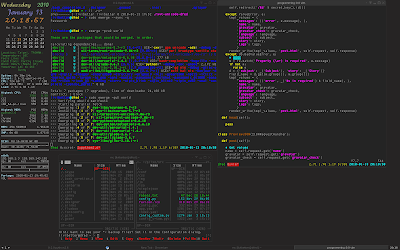
If you have read my last few posts, then you should know I am trying to make my desktop look dark. I feel darkness somehow could look great if everything is set up well.

My Window Manager is Fluxbox, it took me few hours to adjust it. Most of programs I use are GTK+, so I installed a dark theme Clearlooks ZenBurn. But there is a problem for those programs, the icon theme. They usually have high contrast in dark background, but I didn't try to install a new one, or say I couldn't find a good one. However, that's still fine to me with many of them. As for QT apps, I decided not to touch them.

OpenOffice is the worst one under the dark theme, you could see by yourself. Firefox is okay, by the way, I also made a Vimperator colorscheme for it. Chromium is fine with this theme, there are one or two good dark theme which you can download from Google, but I would say just switch to GTK+ theme.

The most serious problem is the websites, only few websites provides theme and that doesn't mean you will get a theme working nice with darkness. I was thinking if I should develop one extension for Chrome, which can automatically adjust the colors, then I stumbled upon userstyles.org. It has dark themes for most popular websites, and amazingly, with Chrome, you can install them as extension just for a few clicks. But they don't always work if the websites get updated.

As for terminal apps, that would be much better since they usually only use 16 colors and that you have full control of those colors. You can simply reduce the saturation or lightness of the colors, so to low the contrast. One app I know is using theme is Midnight Commander.

I don't have desktop image but pure plain color. The only thing I have on desktop is Conky. I changed the colors but it definitely wouldn't fit your taste.

Vimperator goes dark

This post was imported from my old blog “Tux Wears Fedora” on 2010-09-28. Some stuff in this post may be broken, please leave a comment if you see any, then I will try to fix it.

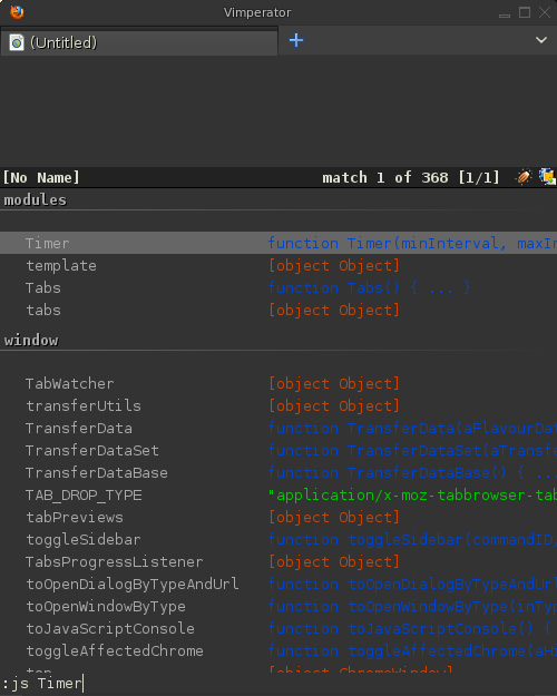
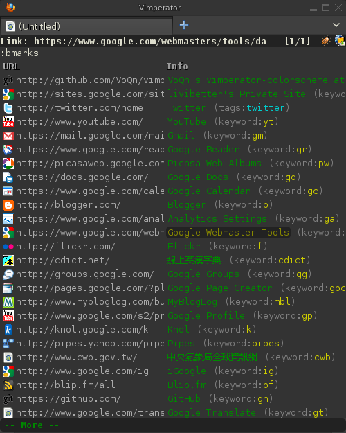
After I made tmux and Fluxbox dark, now Vimperator goes dark, too.

Vimperator goes dark bookmarks list
Vimperator goes dark JS completion list

This Vimperator is created for matching Clearlooks Zenburn GTK+ theme12.

Download the .vimp and put it into ~/.vimperator/colors/. You can preview it in Vimperator by entering :colorscheme <TAB>, you should be seeing it on the list. Add colorscheme vimPgray to your ~/.vimperatorrc. If you are not a Linux user, you need to find out where to put .vimp on your own.

The file is modified from the default scheme from here with quite a lot of changes and some additional explanation, but there are still some I have no idea where they would be applied.


  1. If you are using Windows, just find a nice dark Windows or Firefox theme to match this Vimperator theme. 

  2. Download it and unpack it to ~/.themes, then use the switcher to use it 

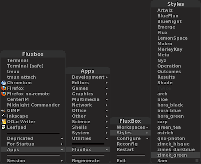
3am: Fluxbox theme for working at 3am

This post was imported from my old blog “Tux Wears Fedora” on 2010-09-28. Some stuff in this post may be broken, please leave a comment if you see any, then I will try to fix it.

The post title should have told you why this theme is named 3am.

I want a theme which is dark, very dark, so you can work while the light is off and the room is pretty dark. At 3am, you must be tired, any bright text would burn your eyes. Darkness, FTW!

3am is modified from bora_black, the author wrote a nice guide, and ArchWiki has a great page of styling. If you want to create, those would be great to start.

Screenshots

Installation

mkdir -p ~/.fluxbox/styles
wget "http://sites.google.com/site/livibetter/blog-files/dotfiles/3am?attredirects=0&amp;d=1" -O !$/3am

Select the 3am style from Fluxbox menu or edit your ~/.fluxbox/init (reconfig, or just log out/in)

session.styleFile:  /home/<USERNAME>/.fluxbox/styles/3am

What I code HTML on four seasons

This post was imported from my old blog “make YJL” on 2010-09-28. Some stuff in this post may be broken, please leave a comment if you see any, then I will try to fix it.

Half a day ago, I suddenly had a very strong feeling while showering, so I tweeted this

How I Code HTML on Seasons:<em>Spring</em> <big>Summer</big> <strong>Autumn</strong> <div style="visibility:hidden"><del>Winter</del></div>.

Now I came up with this (wait for 10 seconds, or reload page to see it again):

Four Seasons: Spring, Summer, Autumn, Winter.
<div id="seasons" style="background-color:#444;border:2px solid #888;-moz-border-radius:5px;-webkit-border-radius:5px;border-radius:5px;padding:5px;">Four Seasons: <em style="color:#4c4">Spring</em>, <big style="color:#f00">Summer</big>, <strong style="color:#ea4">Autumn</strong>, <span style="color:#cee">Winter</span>.</div>

<script type="text/javascript" src="http://www.google.com/jsapi"></script>
<script type="text/javascript">
google.load('jquery', '1');
function kill_slowly() {
var t = $('#seasons span del').text();
if (t.length > 0)
$('#seasons span del').text(t.substring(0, t.length - 1));
if ($('#seasons span del').text())
setTimeout(kill_slowly, 1000)
else {
$('#seasons span').remove();
$('#seasons').html($('#seasons').html()
.replace(/Four/, '<em>Three</em>')
.replace(/Spring/, 'Spring (Something new!)')
.replace(/Summer/, 'Summer (Hot, Beach, Bikinis! XD)')
.replace(/Autumn/, 'Autumn (Falling leaves, beautiful!)')
.replace(/, \./, '. <span style="color:#f00;font-style:italic;">Awesome!</span>'));
}
}
google.setOnLoadCallback(function(){
setTimeout(function() {
$('#seasons span').wrapInner('<del></del>').append(' (Freaking f**king cold!)');
setTimeout(function() {
$('#seasons span').fadeOut(6000);
kill_slowly();
}, 1000);
}, 10000);
});
</script>

Really don't like Winter much.

Setting up SSMTP with Gmail account

This post was imported from my old blog “Tux Wears Fedora” on 2010-09-28. Some stuff in this post may be broken, please leave a comment if you see any, then I will try to fix it.

I set up SSMTP with Gmail because I wanted to get mails for cron results.

I have these in /etc/ssmtp/ssmtp.conf:

root=<USER>@gmail.com
mailhub=smtp.gmail.com:587
#rewriteDomain=
hostname=gmail.com
UseTLS=YES
UseSTARTTLS=YES
AuthMethod=LOGIN
AuthUser=<USER>@gmail.com
AuthPass=<SECRET>
FromLineOverride=YES

Make sure this is only root-and-ssmtp-readable.

And /etc/ssmtp/revaliases:

root:<USER>@gmail.com:smtp.gmail.com:587
livibetter:<USER>@gmail.com:smtp.gmail.com:587

You can test with

echo mailbody | mail -v -s "mail subject" [email protected]
echo mailbody | sendmail -v [email protected]

I don't have this mail command on my Gentoo, but it seems popular in every page I have read.

If you want to send a more complete test email via sendmail you can

echo -e "Subject: mail subject\nTo: [email protected]\n\nmailbody" | sendmail -v [email protected]

Crontab and environment variables

This post was imported from my old blog “Tux Wears Fedora” on 2010-09-28. Some stuff in this post may be broken, please leave a comment if you see any, then I will try to fix it.

I use crontab to do some tasks in background. I have a Python script, I just put it into crontab not long ago. But I got a mail from crontab, the script raised ImportError.

It imports PyQuery, which I just knew and started to use it for my own good. I installed it into my home directory not system-wide. Of course, environment variable PYTHONPATH is correct when I am running that script. But it's not the environment that cron can have.

I didn't know how to resolve until I read /etc/crontab. It has these lines before the table of tasks:

# Global variables
SHELL=/bin/bash
PATH=/sbin:/bin:/usr/sbin:/usr/bin
MAILTO=root
HOME=/

So, I added the following to my crontab

PYTHONPATH="/home/livibetter/lib/python2.5:/usr/local/lib64/python2.6"

Which is from my .bash_profile.

That resolved.

PyQuery, a jQuery-like library for Python

This post was imported from my old blog “make YJL” on 2010-09-28. Some stuff in this post may be broken, please leave a comment if you see any, then I will try to fix it.

Few hours ago, I just wondered if there is a Python library which I can use jQuery's selectors to do some tasks on HTML files. PyQuery came up in search results.

A quick example explains all:

from pyquery import PyQuery as pq

d = pq(url='http://makeyjl.blogspot.com')
for ele_post in d('div.post'):
post = pq(ele_post)
print post('h3.post-title a').text()
print post('div.post-body').text()
print

It prints out all post titles and contents in this blog's first page. It's quick and simple.

Elite Commander skin for Midnight Commander

This post was imported from my old blog “Tux Wears Fedora” on 2010-09-28. Some stuff in this post may be broken, please leave a comment if you see any, then I will try to fix it.
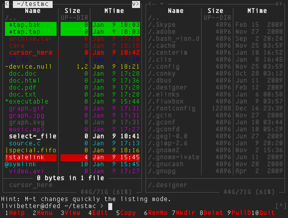
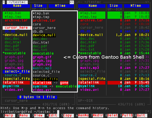
This is probably the first time I tried to create a skin for an application, let's get into the final result straight!
Elite Commander Skin (New)
Save this elite_commander.ini to ~/.mc/skins/elite_commander.ini and edit ~/.mc/ini to have skin=elite_commander.ini under [Midnight-Commander] section.
Few things I have to tell you first:
  1. The version of my Midnight Commander is 4.7.0-pre3.
  2. The original ini is from /usr/share/mc/skins/default.ini on my Gentoo.
  3. I am not satisfied with the background colors because they are too bright, I can change the 16 colors for rxvt-unicode but I rare not to do so because that may not look good in other applications. Hope Midnight Commander will support 256 colors someday.
  4. I feel ashamed to use Elite in this skin's name. :)
Keep in mind when using this skin:
  • The cursor is in red bold text.
  • The marked files is in white bold text.
  • The cursor on a marked file is in red bold and white background text.
My goal of creating this skin is to have a dark background and it sure does and have better looking in a dark room, and to make the colors are close to what I see in Bash Shell on Gentoo. In my .Xdefaults, I have these for colors:
#############
# Rxvt Colors

Rxvt*background: #242424
Rxvt*foreground: #e2e2e5
Rxvt*color0: #242424
So the 'black' in the skin ini actually represents #242424 not #000000 in the screenshot above.
Note that there are two areas are not customizable, which are the hint and shell command areas. You might also want to check up the filehighlight.ini on your system (use locate command to see where they are), which defines the file types.
Midnight Commander is really a good file manager. Once you use to its hotkeys, it's easier than drag-and-drop. I also want to mention this scrollbar indicator patch, hope it would be merged into 4.7 not being push back again, you can see it in this screenshot. It's not necessary stuff but it looks very cool.
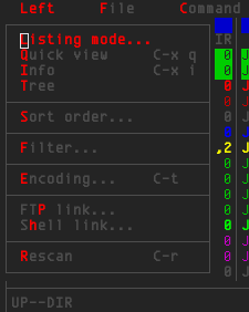
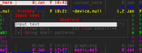
The following screenshots are from old color scheme, you can download the old skin ini:
Elite Commander Skin
Elite Commander Skin Menu
Elite Commander Skin Dialog
Changelog:
  • 2010-01-10: Make the color less sharp.
  • 2010-01-11: Fixed cursor invisible in input box by changing input box's color and removed ini from post.

Coding font

This post was imported from my old blog “make YJL” on 2010-09-28. Some stuff in this post may be broken, please leave a comment if you see any, then I will try to fix it.

A FriendFeeder posted a question about what font and size you use to code, it is an interesting question and I believe every programmer had ever tried to adjust their programming editor/IDE.

My editor is Vim and I use it in urxvt, so here is my setting:

Rxvt.font: xft:Envy Code B 10pt:style=Regular:size=10:antialias=false

The font is Envy Code B (You might also want to check up the R version), I found it is best for me after trying one after another. Before Envy Code, I had been using Terminus for a long time, it's a very popular terminal font. Also I had tried Proggy Crisp and Square for a while. There are other popular programming font but few are really can look good at size 10 point. I also disable the anti-aliasing because it's no good for programming or even in terminal. Anti-aliasing and text files would never be good friends.

Here is a screenshot of how this font looks in Vim:

2010-01-08--06:48:41_1468x1001

I also need to mention the color, I use the color scheme named koehler and the background color of my urxvt is actually not pure black but #242424, I feel it's better the just pure black, more softer, I think.

So, what's your font?

Key control code issue in between Vim and Screen or tmux

This post was imported from my old blog “Tux Wears Fedora” on 2010-09-28. Some stuff in this post may be broken, please leave a comment if you see any, then I will try to fix it.

There is a big issue since I started to use Vim, using Vim with terminal multiplexer such as GNU/Screen or tmux, there is always some issue comes from nowhere and you wouldn't have if you just use Vim in xterm or urxvt.

I had been navigating in my files with a silly way: Pressing Left/Right key to go up/down in a line. There is a faster way: Press Shift+Left/Right to move backward/forward a word. But it never worked when I was in Screen or tmux.

I googled it and got the solutions, and knew the exactly the problem is. If you look at the key control codes (returned by cat -v), you will see the problem.

$TERM         <Left> <S-Left> <C-Left>
xterm ^[[D ^[[1;2D ^[[1;5D
rxvt-unicode ^[[D ^[[d ^[Od
screen ^[[D ^[OD ^[OD

For xterm and urxvt, they both have correct reaction in Vim; for Screen and tmux (tmux uses screen as $TERM), they haven't and they are worse because there is no distinguish between Shift+Left and Ctrl+Left, but for former problem it's fixable.

There are a few ways to fix it, I decided to remap the keys. And I have these in my .vimrc:

map ^[OC <Right>
map ^[OD <Left>
map ^[[C <S-Right>
map ^[[D <S-Left>

You can not just copy them to your .vimrc, you have to input ^[OC by pressing in insert mode: Ctrl+V, <Right>.

New layout

This post was imported from my old blog “make YJL” on 2010-09-28. Some stuff in this post may be broken, please leave a comment if you see any, then I will try to fix it.
Just finished it. A random serie of binary digits background, post content area is wider. I also moved out the entire CSS to external Google Sites. I like it better!

I also added a new poll (I used it for the first time) at sidebar.

The following screenshot is the old one, I got it from some website directory (I forgot to take the old one before I switched the new one :( though I still have old template layout, but I am extremely lazy):


The following screenshot is just for a record :