As of 2016-02-26, there will be no more posts for this blog. s/blog/pba/
Showing posts with label CSS. Show all posts

A week ago, I removed all packages relating to Java from my system. I thought I had absolutely no need of them until I tried to minify CSS, via Makefile, using YUI Compressor which is written in Java. The same situation would have happened when I need to minify JavaScript files, I use Google Closure Compiler, same, written in Java.

Oh, right, thats why I still kept the Java runtime environment, the open source one, IcedTea, I thought to myself.

At this point, you can bet that I want to get rid of Java for real. For IcedTea binary package, its about 30+ MB plus near 9 MB of YUI Compressor and Google Closure Compiler. To be fair, they dont use a lot of space, but I just dont like to have Java on my system since there are only two programs need it. Besides, in order to have IcedTea installed, it pulls two virtual packages and two more packages for configurations.

So, my choice was to use online ones as I already know Google hosted one at http://closure-compiler.appspot.com/ and there is also a popular Online YUI Compressor hosted by Mike Horn.

Its only a matter of commands for achieving Java-less, using curl, first one is for YUI Compressor, second one is for Google Closure Compiler:

curl -L -F type=CSS -F redirect=1 -F 'compressfile[]=input.css; filename=input.css' -o output.min.css http://refresh-sf.com/yui/
curl --data output_info=compiled_code --data-urlencode js_codeinput.js http://closure-compiler.appspot.com/compile > output.min.js

Replace the input and output filenames for yours. If you need to pipe, then use - instead of inputfile, - indicates the content comes from standard input.

Although YUI Compressor can also minify JavaScript, however I found Google Closure Compiler does better job by only a little. If you use YUI Compressor for JavaScript as well, simply change to type=JS.

Both (Online) YUI Compressor and Google Closure Compiler have some options, you can simply add to the command. It shouldnt be hard since you have a command template to work from. I only use the default compression options, they are good enough for me.

I used to like round corners and text or box shadows, three months ago I even added round corners to images, but somehow they have become less attractive, even a bit of more annoying somewhat. I have removed all shadows and round corner, now this blog looks like:


Every thing is in rectangular shape, basically. Also removed styles for form elements, I realized they could be rendered slightly different across browsers, so styling them seems little pointless if you need to adjust for each browser.

Round corner is not bad, it provides more seamlessly visual effect, but you need to have proper padding and good radius in my opinion. More, when you put two together, they may look odd if the styles don't match well.

Shadow could be a bit an issue if you overuse it, unfortunately many developers and websites do that. Some box shadow is fine, heading text with shadow is okay, but I totally can not accept whole text in a page is with text shadow, it makes characters so hard to read. With blur or not doesn't matter, because you may think you have some eye problem since the text is blur.

By the way, I really hate the gradient effect. It's overused for sure, I would say eleven out of ten commercial websites have used it somewhere in a page at least. For me, it looks so cheap for some reason. I don't understand why people like gradient.

In Blogger

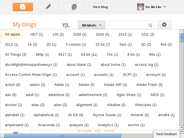
I have mentioned that my labels has grown out of control, 2,119 labels as of 5/8. It's always been a daunting task whenever I need to apply a label to multiple posts or remove therefrom. See for yourself:


See how short that blue grip is? A slight mouse movement could skip dozens of labels easily. When writing, it's basically fine, because it has filter and auto-completion. But in the posts management, no label filter. I have to scroll down carefully.

I added a user style in Pentadactyl to expand the list box's width:
" maximize Labels popup in Blogger
style http://draft.blogger.com/blogger.g* <<EOF
div.blogg-menu-popup {
    left: 0 !important;
}
div[role="listbox"] {
    max-width: none !important;
}
div[role="listbox"] > div > div {
  display: inline-block;
}
EOF
This resolves the issue. Now it looks like:


Even expanded in post writing, too:

In Google Reader

The same situation happens in Google Reader as well, though it's not as severe as in Blogger.


And the following code is similar to one for Blogger:
" maximize Labels popup in Google Reader
style https://www.google.com/reader/view/* <<EOF
.subscription-folders-menu {
  left: 0 !important;
}
.subscription-folders-menu div[role="menuitem"] {
  display: inline-block;
}
EOF
The folders listbox now looks like:

Only works in Firefox, too lazy to add -webkit.


Who is bored
Who can code
Who has time
Venn Diagram

This is how I wasted my time. 100% hand-coded.

Note

This post was posted before many changes to styles, the following is the current style not as of posted.

1H2 goes here and the quick brown fox jumps over the lazy dog

Lorem ipsum dolor sit amet, consectetur adipisicing elit, sed do eiusmod tempor incididunt ut labore et dolore magna aliqua.

1.1H3 goes here and the quick brown fox jumps over the lazy dog

Lorem ipsum dolor sit amet, consectetur adipisicing elit, sed do eiusmod tempor incididunt ut labore et dolore magna aliqua.

You probably have noticed (really, you have already?) that if you click using any mouse button or using Enter, then the link will be highlighted with a blue background.

Note

This blog is no longer using this, nor is YouTube. (2015-12-25T05:11:08Z)

The idea came from YouTubes new designed homepage, I noticed the link feature when its still experimental. I feel its a nice idea, especially you are watching video from a list selectively in new tab. You will know the position of the one you just finish watching, then you can move on.

I stole the idea but not the code, I didnt even use tool to read the code, JavaScript or CSS, its simple stuff. You only need to have I get an idea! And thats what I didnt have.

The code I made you can read the diffs, JavaScript diff and CSS diff. If you know them code, its simple code as I said. The only special thing I want to mention is margin compensates the extra space, which padding uses. The reason of adding padding is the edge of text will be touching the edge of the blue box if you dont use it.

Here are sample link styles with padding and without padding.

Since its possible to open a link using mouse or keyboard, so two events need to be handle.

My originally modified idea is having an indicator flying to new link where user just clicks. Indicator takes off from previous click, then flies to new link, but that seems to be too much and overdo. How about a simple background color fade in and out? Using CSS transition?

Try to press right mouse button with any link, like it?

This blog uses external1 fonts, which are served from http://www.yjl.im/font/. Chromium (5.0) is my main browser and it renders with those fonts correctly. Some time ago, I noticed that Firefox (3.6) didnt render with those fonts but it did download them. I couldnt figure out why Chromium and Opera (10.10) works fine but Firefox doesnt, and its not as if Firefox cant render with fonts because it uses fonts at http://www.yjl.im/. (Internet Explorer (7) doesnt, either, its same reason. But I dont really care about IE)

I suddenly had a guess, a cross-domain thing. So I googled and found the answer2, it refers to Web Font linking and Cross-Origin Resource Sharing, my guess was confirmed.

Short story: you cant use a font (in Firefox) which is not at same domain (origin). I think its right for a browser to have such behavior. Some people like stealing stuff.

Anyway, the solution is to add a response header Access-Control-Allow-Origin:

<FilesMatch "\.(ttf|otf|eot)$">
  <IfModule mod_headers.c>
    Header set Access-Control-Allow-Origin "*"
  </IfModule>
</FilesMatch>

If you uses Apache and you do know how to configure your server, the code above is right for you.

However, many people do not have a webserver, if they do, they probably would host a WordPress blog already and wouldnt encounter this issue. Moreover, Google Sites is probably some peoples file hosting options if they user Blogger, you have no way to add a header. So a normal blogger without skill or knowledge or money, probably wouldnt have a chance to use font-face. Say what? Data URI? For Greens sake, dont use that to serve a font.

As for me, I use Google App Engine at http://www.yjl.im (source code, BSD License). You only need to write a code3. font.py does the job, the following code is the main part:

class FontFile(webapp.RequestHandler):

  # Chromium don't use fonts with text/html as we want.
  EXT_TYPES = {
    '.otf': 'application/x-font-otf',
    '.ttf': 'application/x-font-ttf',
    '.eot': 'application/vnd.ms-fontobject',
    '.svg': 'image/svg+xml',
    '.js': 'application/x-javascript',
    '.woff': 'application/octet-stream',
    }

  def get(self, fontpath):

  fontpath = os.path.normpath(fontpath)
  # Does someone try to get other files?
  if fontpath.startswith('.') or fontpath.startswith('/'):
    self.error(403)
    return

  # Is requested file a font file?
  ext = os.path.splitext(fontpath)[1]
  if ext not in FontFile.EXT_TYPES.keys():
    self.error(403)
    return

  fontpath = 'font/%s' % fontpath
  # Does this font exist?
  if not os.path.exists(fontpath):
    self.error(404)
    return

  if 'Origin' not in self.request.headers:
    self.response.headers.add_header('Access-Control-Allow-Origin', 'http://www.yjl.im')
  elif os.environ['SERVER_NAME'] == 'localhost' or \
    self.request.headers['Origin'] in ['http://www.yjl.im', '']:
    self.response.headers.add_header('Access-Control-Allow-Origin', self.request.headers['Origin'])
  else:
    self.response.headers.add_header('Access-Control-Allow-Origin', 'http://www.yjl.im')
    self.error(403)
    return

  self.response.headers['Content-Type'] = FontFile.EXT_TYPES[ext]

  expires = datetime.datetime.utcnow() + datetime.timedelta(365)
  self.response.headers.add_header('Expires', expires.strftime("%d %b %Y %H:%M:%S GMT"))
  self.response.headers['Cache-Control'] = 'public, max-age=%d' % (86400 * 365)

  f = open(fontpath)
  self.response.out.write(f.read())
  f.close()

The code is fairly simple. First, it checks to make sure no one is trying to do something bad. Then it check the Origin of request header (if client browsers sends it) to see if it is an allowed source. If the request is from an allowed source, then it sets the Access-Control-Allow-Origin to be Origin of request header, same value. Why? Because Access-Control-Allow-Origin can only have one origin assigned, this is the only way to have multiple-origin. Of course you can use *, but that means You are all welcome to hotlink my fonts!.

If its not an allowed source, it sets to http://www.yjl.im and returns 403 status code because its obviously not from allowed source. You can be more creative, serving a special font. ;)

If client browser doesnt send Origin (Chromium doesnt send it), then it sets the header to http://www.yjl.im and sends the font file.

As you can see, I also assign a proper Content-Type. Chromium wouldnt use the font if you dont tell it the right type. (But it doesnt care about cross-origin)

The fonts I use are all downloaded from Font Squirrels font-face Kit4. I dont know much about EOT (Embedded OpenType), but I think the EOT from kit are only allowed to use from same origin. Access-Control-Allow-Origin also works for those EOTs from kit, IE didnt use external fonts but it did after I started to use that header.

[1]Blogger is not a file hosting provider, so if your Blogger blogs need some file for your blog, you have to find other options to host the files.
[2]http://www.thebrightlines.com/2010/01/12/implementing-font-face-cross-domain/ is gone. (2015-12-14T22:15:10Z)
[3]app.yaml doesnt allow you to add header for static file.
[4]It packages all types of a font you need plus stylesheet in one ZIP archive.

I suddenly have this idea: Can I use pure CSS to create a loading indicator (image)? Then I have this:

Loading

Here is a YouTube clip if you can see the above stuff normally.

No, this is not about using position: fixed by default. Take a look at this page as example, scroll down, and see the top-left. Notice the issue metadata stick on top? As far as I know there is no pure CSS for this task, it uses onscroll to do the job.

Here is the source code and you can play with jsFiddle, try the auto-scroll button.

I didnt invent this, the original code is from an answer1 on Stack Overflow, and that seems to be from Stack Overflows code, but with a few of my own modifications. The code requires jQuery.

The #sticky-anchor is the most important part, it does two things:

Just finished it. A random serie of binary digits background, post content area is wider. I also moved out the entire CSS to external Google Sites. I like it better!

I also added a new poll (I used it for the first time) at sidebar.

The following screenshot is the old one, I got it from some website directory (I forgot to take the old one before I switched the new one :( though I still have old template layout, but I am extremely lazy):


The following screenshot is just for a record :

For a long time, I always feel the official SEARCH BLOG button (at the top-left) is kind of confusion. Is that for searching a blog? or for searching a blog posting? or for searching a blog posting in this blog?

Though Blogger.com is one of the biggest blogging platform providers (Is it the biggest?), but that doesn't mean everyone understand each little part of Blogger. Some Blogger bloggers just add their own search box, which is obviously clearly. But why do we reinvent the wheel when there already is one search box?

I decided to make a simple background image to indicate where the search box is. The result looks like:


This background image used Inkscape to render the text, and GIMP to draw the arrow and to mix.

If you want to have same thing on your Blogger blog, you can go to your blog's Dashboard Layout Edit HTML, find body { in CSS section. Just right after that should be background:$bgcolor;, however, this may differ in different blog templates. Make it look like
  background:$bgcolor url(http://sites.google.com/site/livibetter/blog-files/searchthisblogbg-arrow-on-left.png?attredirects=0) top left no-repeat;

Save your template, this should be working now.

If your blog already has background image, then you will need to edit it on your own. This may look terrible in IE6, I only tried this on FF3.

Updated on 2009-10-24: Modified image to match new Blogger navigation bar's layout.

I have to say that I was misled by the paid-feature of WordPress.com. I wasn't aware that is needed to buy credits.

At first, I created a new blog on Blogger, but I didn't like it because I couldn't get perfect URL of that blog. Many people registered blog and awfully only posted one time. On WordPress.com, I still can get a nice URL. I decided to use WordPress.com at the moment, because I saw there is a Edit CSS.

When the time to configure the blog, I then realized that is a paid-feature. It's like most of commericials, you hardly notice the important messages.

However, I have started on it, I wouldn't like to move back to Blogger. I will live without custom CSS.

PostRank is a great service that gives you some good statistics of your blog posts. It provides a nice thematic widget for your top posts popular posts, of course, it also let you customize it. I have been using this thematic widget over my blogs for months. I didn't try customizing it which was due to my prejudice which consists of my experince of iframe. I believed that CSS can not be applied on iframe and the document in iframe, therefore I never tried. Earlier, I read on PostRank's GetSatisfaction, those questions and answers indicate that I was wrong. I tried and I am happy with the result.

If you choose the right-most option while customizing, you will see a partial code like:
var options = {
    "feed_hash": "cbfa4ed49ae77050fb48ccbb47a101bc",
    "num":        6 ,
    "theme":     "diy"
};
new PostRankWidget(options);

Note that "theme":     "diy".

Now check out the following screenshots, first one is the thematic, latter is customized:


Here is the CSS that I applied:
/* BEGIN: PostRank */
/*
ul.postrank-posts {
list-style-type:none;
padding-left:0;
}
*/
ul.postrank-posts li{
margin-bottom:0.1em;
}
a.postrank-value {
color:#000;
width:3em;
display:block;
float:right;
clear:both;
text-align:center;
}
table.postrank-options {
display:none;
}
/* END: PostRank */
I put the PostRank value on the right side because I couldn't make it perfectly on the left. However, the result it not bad at all. If you can make it on left, share with me.

One more thing to note, I only test on Firefox. 90% chance that I believe it will be broken on Internet Explorer since this blog already is.

I want a section which lays three widgets horizontally, Recent Posts, Recent Comments, and Top Posts. If I have them at my sidebar, then the whole page length would be going to long when reading a single post. If I can line them up since they have close widget height, the result should look good. Note that I plan to place this new section just above the original footer section.


Only need to add two parts. One is the CSS, the other is the XML.


Here is the CSS part:

#above-footer-wrapper {
  width:840px;
  clear:both;
}
#above-footer-left {
  width:270px;
  float:left;
  margin-right:15px;
}
#above-footer-middle {
  width:270px;
  float:left;
  margin-right:15px;
}
#above-footer-right {
  width:270px;
  float:left;
}


My page width is 840 pixels, you need to change it to fit yours. I evenly distribute the space to three columns which is 840 = 270 * 3 + 15 * 2. The spacing between columns is 15 pixels.


For XML part, you need to find footer

<div id='footer-wrapper'>


Add new section to be:

    <div id='above-footer-wrapper'>
      <b:section class='footer' id='above-footer-left'>
      </b:section>
      <b:section class='footer' id='above-footer-middle'>
      </b:section>
      <b:section class='footer' id='above-footer-right'>
      </b:section>
    </div>

    <div id='footer-wrapper'>
      <b:section class='footer' id='footer'>
      </b:section>
    </div>


Once you done, save the template and switch to Page Element tab, that should look like:


Here is a screenshot about how it looks like:


Note that the color borders are for easy understanding only.


You can scroll down to see this 3-column section in practical  use.

Had you ever wanted to add a Labels at footer, but it's too ugly to accept?


It's easy to fix with small piece of CSS:


/* BEGIN: Flattening Labels */
div.footer div.Label {
text-transform:none;
}
div.footer div.Label li {
  display: inline;
  }
/* END: Flattening Labels */


After inserting to your template, that would look like:


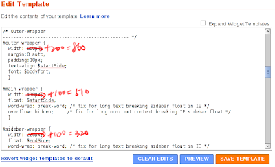
I very like fixed width layout, but my blogs' width is too narrow to fit everything in. I finally decided to widen it. It's very easy to do that, only need to change three numbers:


I increased 100 pixels for each of #main-wrapper and #sidebar-wrapper. Maybe that 320 pixels is too many for a sidebar? Also need to increase #outer-wrapper since it wraps main and sidebar wrappers.