As of 2016-02-26, there will be no more posts for this blog. s/blog/pba/
Showing posts with label layout. Show all posts

I was trying to update the DWM and got this error message from emerge:
dwm.c: In function 'createmon':
dwm.c:654:15: error: 'nmaster' undeclared (first use in this function)
dwm.c:654:15: note: each undeclared identifier is reported only once for each function it appears in
dwm.c: At top level:
dwm.c:1030:1: warning: 'incnmaster' defined but not used
make: *** [dwm.o] Error 1
It seems that dwm 6.0 has included the code of nmaster patch, or a re-implementation. Anyhow, you need to update your config.h for nmaster variable, even you don't use nmaster.
/* layout(s) */
// snip
static const int nmaster      = 1;    /* number of clients in master area */
// snip

static Key keys[] = {
// snip
 { MODKEY,                       XK_i,      incnmaster,     {.i = +1 } },
 { MODKEY,                       XK_d,      incnmaster,     {.i = -1 } },
// snip
The incnmaster function is to change the amount of clients in master area. I bind them to the keys which fits into my configuration, here is the diff I updated for this upgrade.

Before 6.0, I hadn't used nmaster patch, but I did feel the need of similar feature. There were some moments, master area is, well, too big for just one client. However, I have gridmode patch, sometimes it can sort of have the layout I need.

Just finished it. A random serie of binary digits background, post content area is wider. I also moved out the entire CSS to external Google Sites. I like it better!

I also added a new poll (I used it for the first time) at sidebar.

The following screenshot is the old one, I got it from some website directory (I forgot to take the old one before I switched the new one :( though I still have old template layout, but I am extremely lazy):


The following screenshot is just for a record :

I want a section which lays three widgets horizontally, Recent Posts, Recent Comments, and Top Posts. If I have them at my sidebar, then the whole page length would be going to long when reading a single post. If I can line them up since they have close widget height, the result should look good. Note that I plan to place this new section just above the original footer section.


Only need to add two parts. One is the CSS, the other is the XML.


Here is the CSS part:

#above-footer-wrapper {
  width:840px;
  clear:both;
}
#above-footer-left {
  width:270px;
  float:left;
  margin-right:15px;
}
#above-footer-middle {
  width:270px;
  float:left;
  margin-right:15px;
}
#above-footer-right {
  width:270px;
  float:left;
}


My page width is 840 pixels, you need to change it to fit yours. I evenly distribute the space to three columns which is 840 = 270 * 3 + 15 * 2. The spacing between columns is 15 pixels.


For XML part, you need to find footer

<div id='footer-wrapper'>


Add new section to be:

    <div id='above-footer-wrapper'>
      <b:section class='footer' id='above-footer-left'>
      </b:section>
      <b:section class='footer' id='above-footer-middle'>
      </b:section>
      <b:section class='footer' id='above-footer-right'>
      </b:section>
    </div>

    <div id='footer-wrapper'>
      <b:section class='footer' id='footer'>
      </b:section>
    </div>


Once you done, save the template and switch to Page Element tab, that should look like:


Here is a screenshot about how it looks like:


Note that the color borders are for easy understanding only.


You can scroll down to see this 3-column section in practical  use.

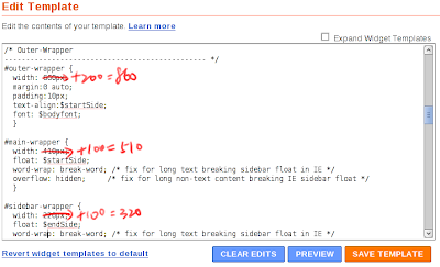
I very like fixed width layout, but my blogs' width is too narrow to fit everything in. I finally decided to widen it. It's very easy to do that, only need to change three numbers:


I increased 100 pixels for each of #main-wrapper and #sidebar-wrapper. Maybe that 320 pixels is too many for a sidebar? Also need to increase #outer-wrapper since it wraps main and sidebar wrappers.