As of 2016-02-26, there will be no more posts for this blog. s/blog/pba/
Showing posts with label list. Show all posts

In Blogger

I have mentioned that my labels has grown out of control, 2,119 labels as of 5/8. It's always been a daunting task whenever I need to apply a label to multiple posts or remove therefrom. See for yourself:


See how short that blue grip is? A slight mouse movement could skip dozens of labels easily. When writing, it's basically fine, because it has filter and auto-completion. But in the posts management, no label filter. I have to scroll down carefully.

I added a user style in Pentadactyl to expand the list box's width:
" maximize Labels popup in Blogger
style http://draft.blogger.com/blogger.g* <<EOF
div.blogg-menu-popup {
    left: 0 !important;
}
div[role="listbox"] {
    max-width: none !important;
}
div[role="listbox"] > div > div {
  display: inline-block;
}
EOF
This resolves the issue. Now it looks like:


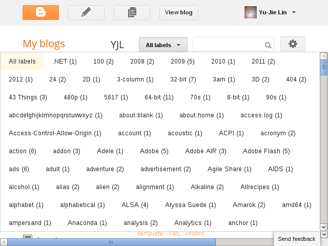
Even expanded in post writing, too:
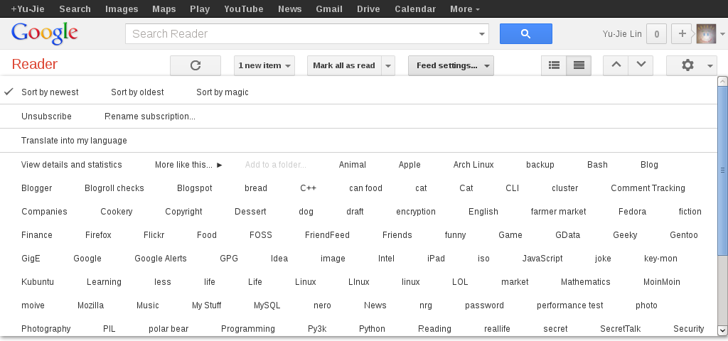
In Google Reader

The same situation happens in Google Reader as well, though it's not as severe as in Blogger.


And the following code is similar to one for Blogger:
" maximize Labels popup in Google Reader
style https://www.google.com/reader/view/* <<EOF
.subscription-folders-menu {
  left: 0 !important;
}
.subscription-folders-menu div[role="menuitem"] {
  display: inline-block;
}
EOF
The folders listbox now looks like:

I made changes for quote and bullet points. Here are two screenshots of old styles:

old quote style

old bullet point style


Now the quote looks like this.

And the list looks like
  • Item 1
  • Item 2
    • Subitem
  • Item 3
I used to like the old ones, I felt all content should fit into the box, never gone out. I have JavaScript code to re-size images whose width (with image border) isn't 640px. If it's larger, it makes the image smaller; even if it's smaller, it re-sizes it to be 640 pixel in width. I want to keep the edge sharp. But I realized that this wouldn't be a good idea for screenshots, so I allow screenshots to be what they are.

Then, I started to embed YouTube videos which is wider than 640px. Things started to get out of control. Originally, the post title is only ones can be wider because seeing title wraps, that's just so weird. Now, you can see waves at two sides of content box.

Recently, I feel this new style is better. It's not because those images or YouTube videos. I like those bullet points and the quotation marks stay on margin. Maybe this way, they (the real content) are fit into the box, align the edges?