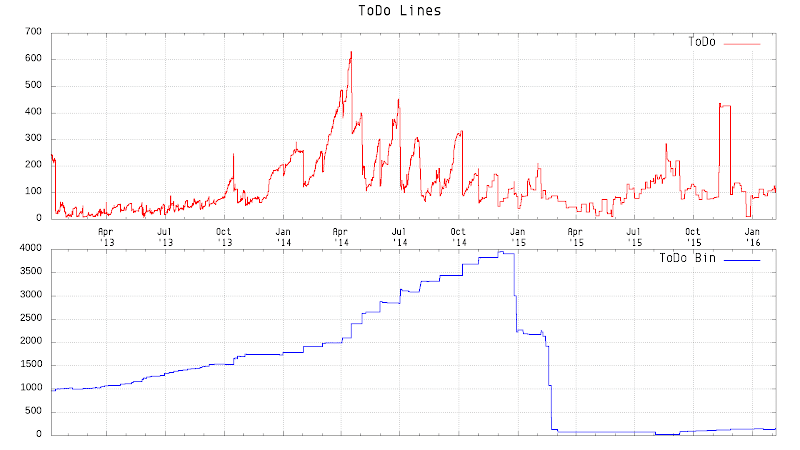
In January, 2013, I started to record the lines of my ToDo files which are taken in vim-notes. One year later, I used Python and matplotlib to draw a graph.
Now, they are 3 years old and they look like:
Its quite interesting to take a look at it and I can see some moments from this figure. Here is some remarks:
- For both in the first year, there were much more changes than the last two. The reason for that is I constantly :w the notes when every I made a changes to them.
- As the end of the first year, you can spot a fairly long flat line in ToDo Bin, thats when I only moved stuff from ToDo to ToDo Bin once a month, and you can clearly see the trend last for a year until the end of second year.
- During the first half of second year, I still constantly saved the ToDo, but since the September of the year, I reduced the saves. Normally, only when I had to leave X Window or reboot, then I would save.
- The last year, there is a significant drops in Bin, twice, one at the end of second year, another at around middle of February. They were clean-ups, big ones, as you could see the lines of ToDo Bin almost reached 4,000 lines in the end of second year. I had to do something, or the Bin would be like a dump, although it was meant for that.
There is one more thing I wanted to note, though unrelated to the lines, that is gnuplot is much easier to plot this type of graph, and the quality is great almost just out-of-the-box. I actually had updated the Python script for this and generated one before I got a chance to installed gnuplot of making a video, and I tried it out on the lines.

0 comments:
Post a Comment